Portrait vs Landscape Slot Layout: Which Is Easier to Use?
With the rise of mobile gaming, especially in the slot category, designers and developers face an important question: should slot interfaces be designed for portrait orientation or landscape orientation? This decision directly impacts usability, engagement, and player satisfaction. Companies like MrQ and Red Tiger have invested heavily in crafting seamless experiences for mobile slot players, emphasizing the need for UI that feels intuitive, responsive, and ergonomic.
In this post, drawing on insights from Google’s web.dev platform and using open web technologies like HTML5, we will explore the pros and cons of portrait slot UI versus landscape slot UI. We'll focus on key themes relevant to mobile orientation design, such as small-screen UI prioritization, touch-first ergonomics and thumb reach, and responsive layouts that adapt beyond fixed breakpoints to accommodate variable device sizes and aspect ratios.
Why Orientation Matters in Mobile Slot UI
Modern mobile browsers, including iOS Safari and Android Chrome, allow web apps and games to respond dynamically to orientation changes. However, orientation is not just about screen real estate—it influences how users interact with the game, especially given the constraints of the human hand and the thumb's natural reach zones.
The two primary orientations for mobile slot interfaces are:
- Portrait (Vertical): The screen height is greater than its width.
- Landscape (Horizontal): The screen width exceeds its height.
Each orientation offers different design affordances and challenges for game UI, controls, and visual hierarchy.
Portrait Slot UI: The Case for Vertical Play
Advantages of Portrait Slot UI
The portrait orientation is the default way most people hold their phones. Here’s why portrait slot UI is often easier to use:
- One-hand thumb reach: Since most users hold their phone with one hand, portrait orientation allows easy thumb access to the majority of interactive elements placed within the natural reach area—typically the bottom two-thirds of the screen. This reduces thumb travel and fatigue.
- Focus on core gameplay: With a narrower horizontal space, UI elements such as paylines, balance, and spin buttons can be prioritized and layered in vertical stacks with proper spacing, reducing clutter.
- Visibility for vertical reels: Many slot games display vertical reels, which fit naturally in portrait layout, emphasizing gameplay while simplifying motion tracking for the eye.
- Fits various device sizes and aspect ratios: Portrait slots can more easily adjust to tall, narrow displays like modern smartphones without losing visibility on buttons or instructions.
- Suitable for quick sessions: Many players spin slots on-the-go in brief moments, and portrait orientation supports single-handed, quick tap interactions with consistent ergonomics.
Challenges of Portrait Slot UI
- Limited horizontal space: Some information, such as paytables or detailed stats, requires horizontal scrolling or layered menus.
- Potential cramped controls: If too many features are forced onto the limited width, buttons can become smaller or less distinct, violating touch target guidelines recommended by Google web.dev for mobile usability.
Landscape Slot UI: Pros and Cons of Wide Viewports
Advantages of Landscape Slot UI
- Larger horizontal canvas: The wide layout enables developers to display multiple reels, bonuses, and additional game controls side-by-side without crowding.
- Better for multiplayer or tournaments: Landscape slots can simultaneously show chat windows, leaderboards, or social elements, ideal for community-driven platforms.
- Visual spectacle: Red Tiger and other premium slot providers often use high-fidelity animations and expansive backgrounds that shine in a landscape layout.
- Two-handed grip ergonomics: Landscape mode encourages players to use both hands, allowing for more deliberate, less error-prone inputs.
Challenges of Landscape Slot UI
- Thumb reach discomfort: For single-handed users, especially right-handed ones, reaching far left or right corners in landscape can cause strain. The recommended touch targets may be harder to access quickly.
- Compatibility issues with portrait-first mobile browsers: Since many mobile browsers load portrait layouts by default, landscape slots may require additional prompts or transition screens, potentially disrupting user flow.
- Screen rotation friction: Not all players want or remember to rotate their devices; inconsistent orientation switching can cause confusion and broken short sessions.
Responsive Layouts vs Fixed Breakpoints
A key insight from Google web.dev is the importance of designing with responsive layouts that fluidly adjust UI elements based on the current screen size and orientation rather than relying on fixed breakpoints that target specific device widths.
For slot interface design, this means:
- Flexible reels and controls: Use CSS Grid or Flexbox to allow reels to reposition depending on orientation. For instance, in portrait, reels can stack vertically, while in landscape, they align horizontally.
- Dynamic scaling of buttons and text: Maintain minimum tap targets (44x44 pixels recommended by Apple and Google) by scaling elements, ensuring taps aren’t missed regardless of device.
- Conditional menu visibility: Hide secondary options behind hamburger menus or collapsible panels in portrait to preserve vertical space but make them visible in landscape if space permits.
MrQ, a leader in responsive slot web apps, implements such fluid layouts extensively across mobile browsers, ensuring consistent playability whether on a compact 5-inch device or a larger 7-inch tablet.
Touch-First Ergonomics and Thumb Reach Zones
From a UX writing and product content perspective, understanding thumb reach zones is crucial when writing button labels and placing UI elements. Actions like spinning the reels or opening help panels should be placed where the thumb naturally rests or can reach with minimal effort.
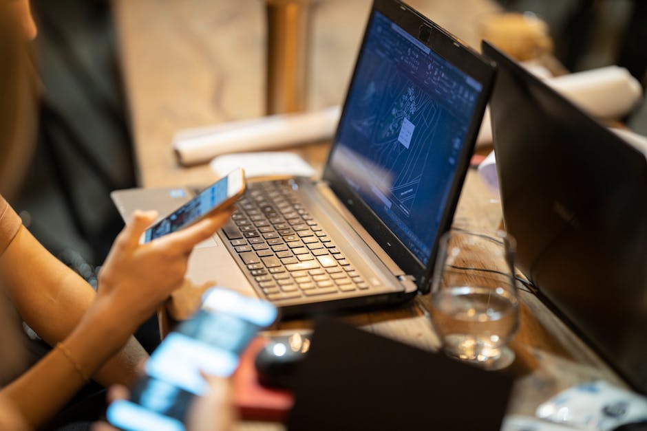
In portrait mode, critical tap targets cluster near the bottom for easy thumb access; landscape layouts risk spreading controls outside comfortable reach zones.
Variable Device Sizes and Aspect Ratios
The mobile device market is highly fragmented, from small 4-inch phones to large 7-inch foldables and variable aspect ratios like 18:9, 21:9, or squarer 4:3 tablets. Slot UI must sizedesk not only switch between portrait and landscape but also gracefully handle these differences.
- Adaptive scaling: Text, icons, and reels should scale proportionally to avoid tiny buttons that frustrate players.
- Visibility prioritization: Essential info like balance, wins, and spin controls should always be visible onscreen without requiring scrolling or extra taps.
- Hidden behind menus: Less-frequently used features (e.g., detailed statistics, settings) can be tucked behind menus or collapsible panels to save space.
Red Tiger’s slot games demonstrate elegant handling of these issues, ensuring crisp visuals and responsive UI across browsers and devices, using HTML5’s canvas and scalable SVG elements combined with CSS media queries.
Summary: Which Orientation is Easier to Use?
Both portrait and landscape slot UI designs have their merits based on context, device, and user preference. Here's a quick comparison table:
Aspect Portrait Slot UI Landscape Slot UI Ease of single-hand use Excellent; optimal thumb reach Moderate; requires more thumb travel or two hands Screen space for information Limited horizontal space; vertical stacking Expanded horizontal space; more simultaneous info Player engagement Great for quick sessions and casual players Better for immersive experiences and social play Responsive layout adaptability Easier to scale across devices with variable aspect ratios Requires explicit prompting or UI hints for orientation changes Compatibility with mobile browsers Default orientation; quick loading Needs orientation switch handling; less directBest Practices and Recommendations
- Prioritize portrait orientation for casual, on-the-go slot players emphasizing minimal thumb travel and quick spins.
- Leverage landscape orientation for premium games with rich graphics, multiplayer features, or tournaments requiring more on-screen real estate.
- Utilize responsive CSS frameworks that adapt layouts fluidly across both orientations without relying solely on fixed breakpoints.
- Ensure all interactive elements meet Google’s touch target size recommendations (minimum 44x44px) to reduce missed taps.
- Hide infrequently used menus behind toggles to avoid UI clutter, particularly in portrait mode.
- Conduct regular usability testing across devices and orientation states to identify friction points.
Conclusion
Choosing between portrait and landscape slot UI design is not a matter of one-size-fits-all. Understanding how different players hold and interact with their devices is essential. By following ergonomic principles, responsive layout techniques, and leveraging modern HTML5 and mobile browser capabilities—as MrQ, Red Tiger, and many others do—developers can craft flexible, accessible, and enjoyable slot experiences that delight players in either orientation.
Ultimately, the easiest-to-use mobile orientation is the one that respects the player's context, device, and preferences while optimizing thumb reach and content visibility. Adopting thoughtful orientation design will ensure your slot game stands out in the competitive mobile entertainment landscape.